Ten Modern Home Design Tips
What is a modern home and how do you design one? Theoretical arguments on exactly what defines the modern style permeate the academic field of architecture. For the sake of this article and for simplicity, we are referring to the range styles that lie somewhere on the modern, mid century modern, and contemporary spectrum.
Over the years, we’ve distilled down certain characteristics that are common between many of these projects. The characteristics range from small details to overall site planning strategies. Below is our list of tips for designing a modern home.
1. Plan Shape
A simple and clear plan shape is a great way to start the design for modern home. We like using plan shapes that naturally create exterior spaces and courtyards. The goal is to layout the plan so the negative space from the building mass creates new spaces. For example in a “U” shaped layout, the negative space inside of the shape has the potential to become a beautiful outdoor space shielded on three sides by the mass of the home. Below is a sketch showing six plan shapes that we love to start our designs from. The grey represents the building mass, and the green represents the negative space that we turn into an outdoor patio or landscaping.
Some of our favorite floor plan layouts. The shapes of the grey building mass naturally create the courtyard spaces shown in green.
2. Connection Between Indoor and Outdoor
Establishing connection between the indoor and outdoor spaces is essential in modern home design. This is typically achieved with transparent materials, mainly glass. The location, size and detailing of glass are critical in reinforcing the connection between the interior and exterior.
One of our favorite strategies is full height, floor to ceiling panes of glass with large planting beds just outside the glass line. In this method you are visually eliminating the enclosure/wall and allowing the inhabitant to see nature from the inside of the space.
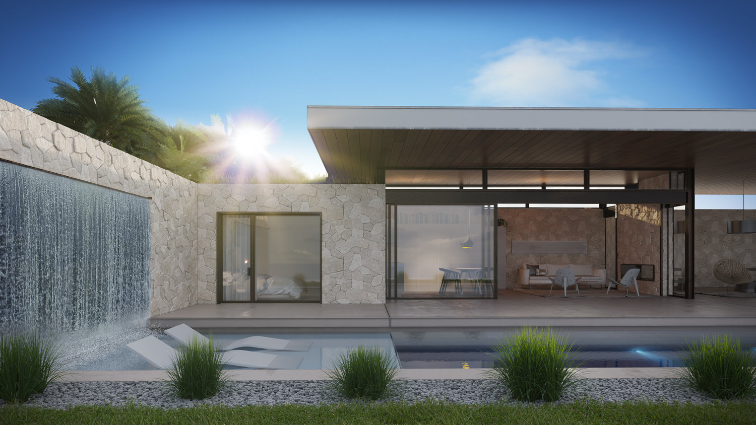
Section sketch of our Trabuco Canyon home. Large panes of glass allow the interior of the home to connect with the exterior landscape and water feature.
3. Carrying Materials From the Interior to Exterior
Detailing the sill (where the bottom door track hits the ground) properly to create the illusion of the interior floor surface continuing out to the exterior deck/patio can help blur the boundary between interior and exterior. When the eye perceives the interior surface continuing from the interior to the exterior, it can make the space feel significantly larger.
This technique also reinforces the connection between the interior and exterior as mentioned above.
4. Seam Direction
One of our favorite tricks is to orient the wood seams on the ceiling soffit out towards the view. This naturally directs your eye in that direction. Strategically placing the building on the site towards the view and orienting the seams in this way can be a powerful way to induce a sense of expansiveness. It can also help connect the interior to the exterior.
The wood boards on the ceiling are oriented to bring your eye out towards the view.
5. Baseboard and Transition Details
Properly detailing the connection from the floor to wall and ceiling to wall is essential. Traditionally, these transitions are covered with trims and moldings. We like to take a different approach called a flush base or shadow base. This celebrates the transition rather than hiding it behind trim and molding. Shadow bases and flush bases are small reveals that transition from one material to the other via a precise single shadow line.
The shadow reveal at the floor and wall transition is a simple and elegant
6. Detailing of Door Sills, Jambs and Heads
We are sticklers on door details. Door sills are where the bottom of the glass door touches the floor. Door jambs are where the vertical frame of the glass touches the wall. Door heads are where the top rail of the door touches the ceiling or soffit. When we are detailing these conditions, the goal is to reduce the amount of reveals, shadow lines, and materials as much as possible.
Recessing the door sill track down into the floor, recessing the jamb into the wall finish and recessing the head track into the ceiling material is a great way to accomplish this. Recessing the tracks allows the only a small rail to be seen on the floor as shown on the image below.
Some of our favorite door manufacturers that provide products with this capability are Fleetwood, Vitrosca, Western and Skyframe.
7. Flush Outlets and Face-plates
This is a small detail that packs a lot of punch. We have been using a product called TruFig that allows face plates to be flush mounted on your walls. Keypads, switches and plug plates can all be recessed using this system. There is a hefty price tag that goes along with each plate so we recommend only using this detail in your primary entertaining spaces.
Tru Fig Flush Mounted Outlets
8. Simple Exterior Massing
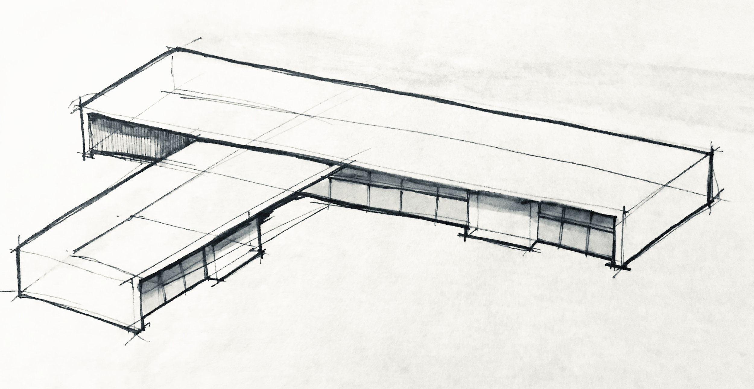
A simple yet intentional building shape is key to designing a good modern home. Reducing the amount of “moves” down to a minimum gives clarity to the building. This often means a more efficient structural system and reduced complexity during construction.
Concept Sketch by Rost Architects for Massing of Trabuco Canyon Residence
9. Exposed Structural Members
We love to expose structural members in our projects. There is authentic and raw beauty in exposed steel and wood beams. When structural members are celebrated and left exposed, inhabitants can understand the building and see how it was constructed.
10. Pocket Doors
Pockets are a great way to conceal your glass sliding doors. Building in pockets into your wall assemblies allows you to slide every panel of the door into a built in cavity and completely conceal them.
Bonus: Clerestory Windows
We love using clerestory windows in our designs. Clerestory windows are windows that are typically located above a door, usually at the wall to ceiling transition. These windows are great for providing natural ventilation while maintaining security.
With a clerestory window, you are able to open the window without having to worry about pests and intruders because it is elevated off the the floor level higher on a wall. Clerestory windows can also make the roof appear to be floating and allow natural light to come into a space on walls facing unsightly views. In the project below, we placed clerestory windows above the rear wall to allow natural light into the space and screen views to the street.
Rost Architects Pool House Design with clerestory windows above sliding doors.
Bonus: Asymmetry
In classical architecture, symmetry is everything. Our preference is for asymmetry that is balanced and well proportioned. This can be difficult to achieve but it provides spaces with a dynamic feel of movement rather than static feel. Below is a an asymmetric design for a fireplace in one of our project. It directs your eye out towards the view and creates a sense of movement between the hearth/seating bench and the vertical fireplace mass.
Rost Archtiects design for an outdoor living area with asymmetrical fireplace design.
If you are starting on the design of your modern home, feel free to reach out to us at www.rostarchitects.com.


